So much happens within every municipality that needs to be shared: upcoming events, new initiatives, important updates, celebrations of success. And there’s myriad ways in which each department of City Hall interfaces with the public in routine ways, from applications for parking permits to business licenses, to simple correspondence to the uniforms of Department of Public Work employees repairing the streets. Inherent in all of this communication is a message about how the municipality functions. Each represents an opportunity to say something about the City of Chelsea itself.
To make the most of these opportunities, the City of Chelsea has just released a Style Guide that details the specific graphic style for all communications from the ten City Hall departments and nearly twenty boards and commissions. The goal of the effort is to establish a consistent brand identity that’s professional, clear, and attractive. The guide details typography, colors, photography and formatting that together create a distinctive look for City Hall’s print and digital materials. For administrative staff at City Hall, a suite of templates facilitate the quick creation of regularly needed materials within the established style. The refreshed documents include letterhead and envelopes, agendas and minutes, business cards and brochures, forms and flyers, reports and PowerPoint slide decks.
The underlying goal of the project is that quality, consistent design will demonstrate a unified voice whenever expressed by an agent of Chelsea’s city offices. Quality design demonstrates competence and professionalism. Through a clear graphic identity the public will be able to better recognize services provided by municipal government.
Over the past eight months, a team of City Hall staff representing a variety of departments worked with design consultant, Catherine Headen, to develop the guide. After reviews, working sessions and a special event with City Hall staff the completed Guide and templates are formally released this week.
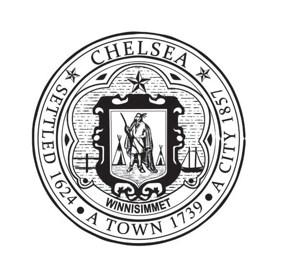
A major aspect of the work was refining of the City Seal. Over the decades numerous changes had led to an evolution of the design, drifting the illustration away from the original as detailed in the banner hanging Chelsea’s City Council Chambers. When the team began, nearly a dozen different images were in use as a City Seal across municipal departments. The design details had changed so significantly that the group was surprised to discover lost elements prescribed within the City Charter: “The following shall be the device of the corporate seal of the city: A representation within a circle of a shield surmounted by a star, the shield bearing upon it the representation of an American Indian chief and wigwams; at the right of the shield, a sailboat such as was formerly used for ferriage; at the left of the shield, a view of the city and a steam ferryboat; under the shield, the word “Winnisimmet;” around the shield, the words “Chelsea, settled 1624; a Town 1739; a City 1857.”
The unveiling of the new look with take place over time. City staff will continue to use the print materials already on hand but will use the new templates for all their future materials. The new style is intended for the main City Hall departments and doesn’t extend to the City’s Police and Fire departments or to the schools.